Starting off
Learning & Development
First I had to understand design systems, what they were, what they do, and how do I build one from scratch? I researched other products and their design systems, such as Material Design, Altassian, Carbon, GOV.uk, Mailchimp and Air B&B to name a few. I also watched tutorials on the process of creating a design system, learning about documenting components of the current product (which is how we discovered the 32 button styles!) and adopting the atomic design methodology.
Testing & Iterating
Best Practise & Accessibility
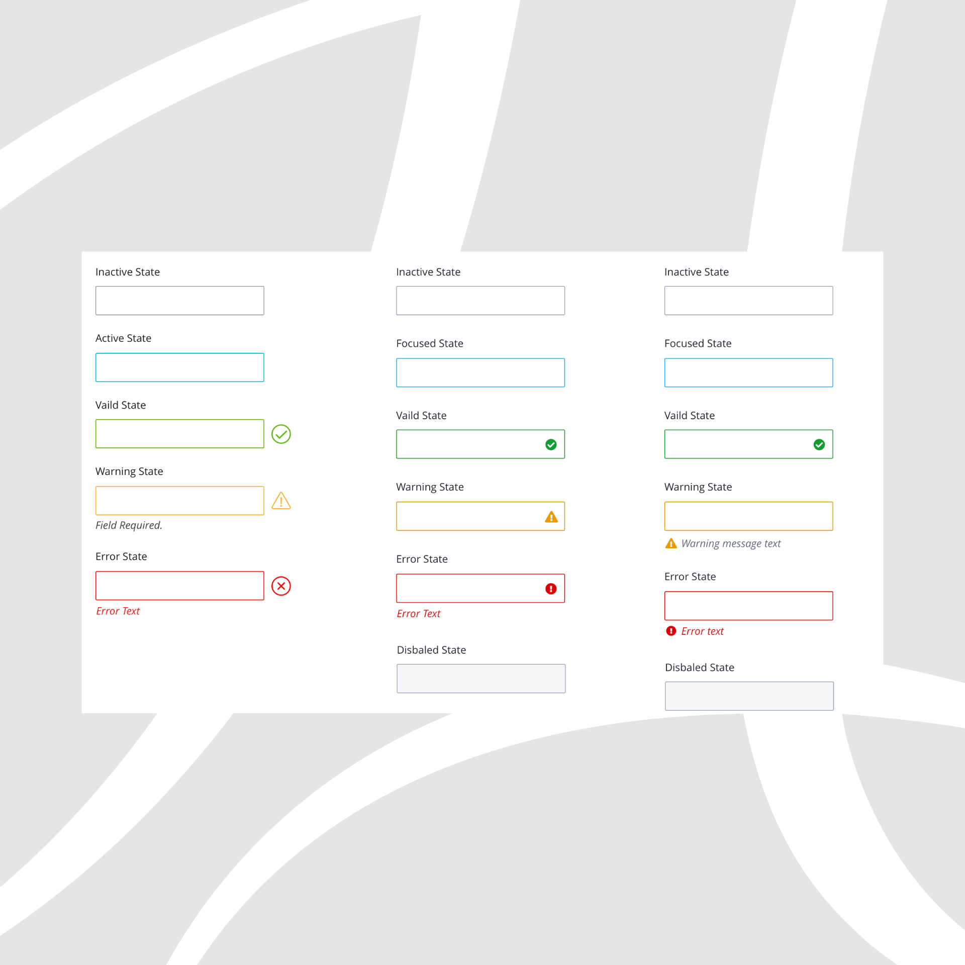
During the process of creating the design system, I was constantly testing ideas and iterating based on feedback. I started to focus on accessibility and colour contrasts, as a product we wanted to ensure we would meet at least AA standards to provide an inclusive experience. I also would research best practise on various components and ensure all concepts abided by Usability Heuristics and Jakob's Law of the Internet User Experience.
Prototypes of elements were created during this process, such as the Header redesign. Having components pre-built like this allowed for a smooth transition to implementation of the design system.
Implementation
Version 1
Once we had reached a point in the design system we were happy with, project Tidy-grant was initiated. This would involve clearing all current styling and introducing the new SASS stylesheet, which would provide easy maintenance by using variables. We took things piece by piece, first introducing the new header, to the new improved impersonate feature. This transition process took a number of months to fully complete.
Version 1 sees a number of UX improvements and an update in UI. Version 2 will see us further improving UX, spending more time in areas that were out of scope of iteration 1 due to old technology constraints.

Flexi-Grant® pre Design System vs Mid-implementation of Design System