Thrift App

Fintech / User research / Wireframing / Prototyping / Interface design / UX / UI
Project Overview
This concept was created as part of a design task for an opportunity with a Fintech company.

Thrift is a banking app focused on helping users manage and successfully save money, targeted towards Millennials and Gen-Z.
The Brief
Create a concept from scratch for a bank that is fully digital, allowing operations and services to be accessed by customers via mobile.

Demonstrate how you can create a tangible product that services customers' needs, that you define valuable for a digital bank.
The Process
Discovery
As the Fintech industry is fairly new to me I decided to firstly learn a bit more about what it is. The main take away is the future of banking is mobile driven, making transactions faster and more efficient. The pandemic exacerbated the growth of the industry, and due to many lockdowns, users were forced to seek alternative ways to bank.
According to Insider Intelligence research, mobile banking is used by 89% of people, appealing not only tomillennials (97%) but also to generation Х(91%) and baby boomers (79%)
Competitors & Target Audience
Discovery
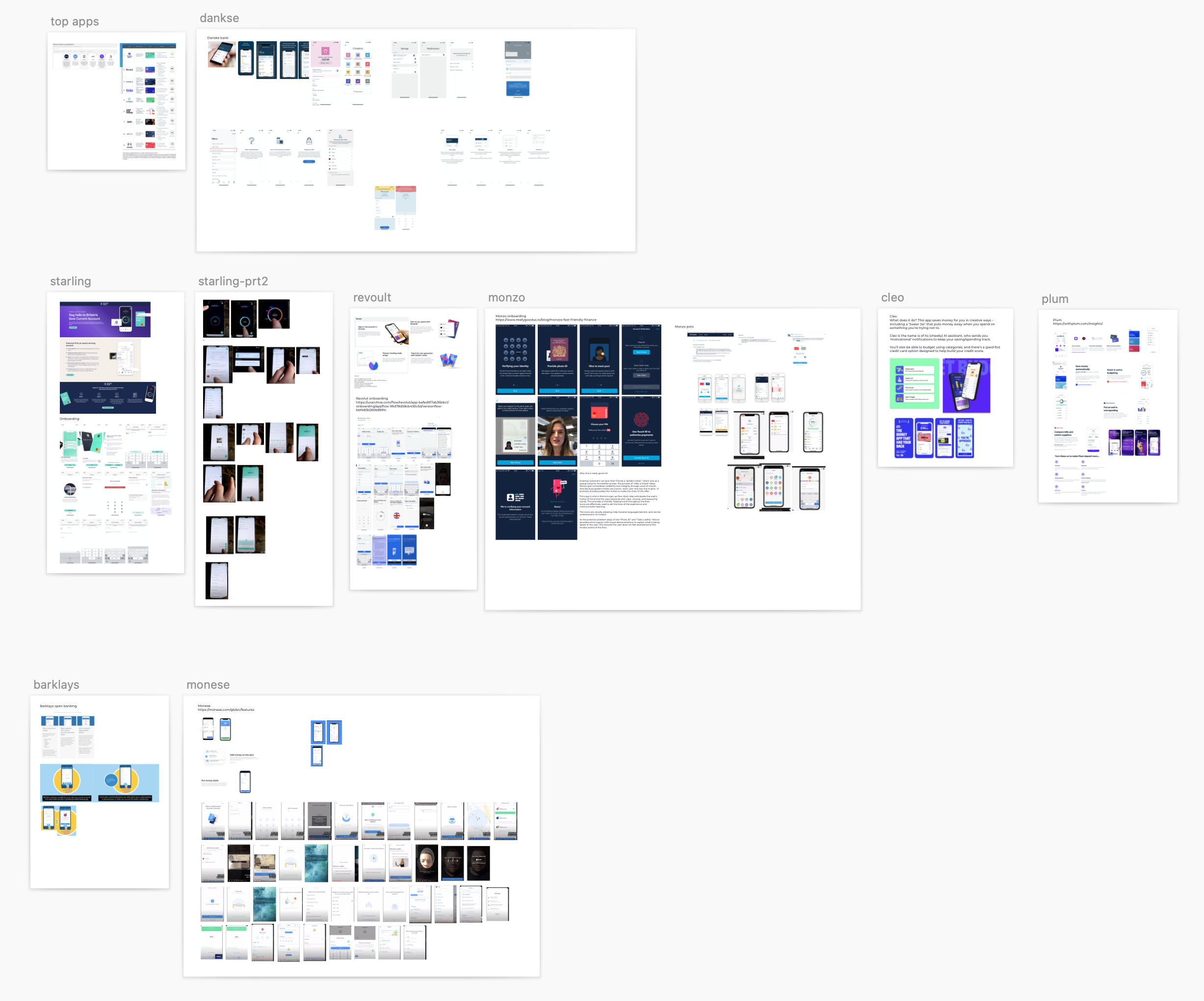
I decided to start by looking at what was already on the market, looking at the top ranked brands. Personally, the first I had heard about the Fintech industry was when Monzo became popular a few years ago. As their user-base grew, the coral cards were hard to miss, and I wondered what they were about.

I decided to look for apps similar to Monzo, as there have been many other brands in the industry making the spotlight since then. I researched their features, wanting to understand what made people want to use these particular brands. I also wanted to understand their user flows, how they handled sign-ups, viewing accounts, transferring money etc.
Mobile app users view their balances(90%), track recent transactions (79%), pay bills (59%), transfer funds (57%),and contact client support (20%). 
I decided to focus my target market on Millennial and Generation Z. Users who are in an era of financial crisis, meaning it's important now more than ever, to be in control of finances.
According to a Bankrate survey, young adults were hardest hit during the pandemic. 46% of generation Z say they currently have fewer emergency savings than they did before the pandemic. 

GenerationZ… want to learn and discover new options for managing their finances… FIs need to become facilitators which provide financial support rather than just holding money. Cost of living is on the rise, the UK is experiencing its highest levels of inflation for 30 years.

These experiences influence the way Gen-Z look at money and the future. They are tech driven and working against a background of uncertainty. This means they behave in a very different way to older generations.
https://www.ncr.com/blogs/banking/gen-z-consumers-financial-needs
Empathy mapping & Personas
Define
After researching the problems and needs of users I documented some of them in the form of an empathy map to illustrate attitudes and behaviours and aid decision making. I also created a couple of personas that I could refer back to during the idea generation and wireframing process.
Defining requirements
Define
I wrote some user stories so I could define functionality requirements and have a checklist to ensure my concept met user needs.
As a user, I want to be able to:
- see transactions that have happened in my account so I can track my spending
- see pending transactions that are going to come out of my account soon so thatI can factor that into my remaining balance
- easily transfer money between accounts and to other people so that I don’t have to physically visit a branch or hand a person - money when I next see them
- set aside money separate from my main account so I can see how much I have saved.
- connect accounts from more than one bank so I can manage my money in one central place
- contact someone when I need help so I can quickly have my issue resolved.
- be informed of ways I can save money so that I don’t waste money
User Flow
Ideate
Next I looked at the user flow, from sign up to returning users and their journies within the app. I started with pen and paper, iterating, until I was happy with a flow and mocked it up digitally using draw.io.
Sketches/low-fi wireframing
Ideate
Drawing inspiration from the competitor apps and other examples I began to sketch ideas for my app. Pencil and paper is the most efficient way for me to brainstorm ideas and iterate quickly. Once I was happy with an approach I moved to digital versions where I could add more structure to the interface, while still being basic in terms of the design, using a grayscale colour palette to focus more on interaction than look and feel. Applying aesthetics comes last for me, getting the basic structure right was more important.
Hi-fi wireframing/Prototyping
Prototype
As I only had two days to flesh this idea out, I didn't create a prototype until I had hi-fi wireframes. In a real world scenario I would always use the basic low fidelity wireframes in a prototype to ensure usability is to a high standard, so the user in testing doesn't focus and get distracted with their opinions on aesthetics rather than the experience of using the app.
The deliverable was using an Invision prototype, so I used the Craft plug in for Sketch to create the prototype